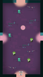
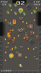
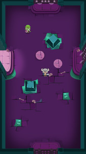
Here’s a quick progression of one of our current levels.
Initially we had pixel art. Very little identity, not an interesting color scheme. Although pixel art is charming, I decided to use an art style I was more familiar with. Basically vectors in Photoshop.
This was a first stab at a more interesting color scheme and adding that classic isometric look. I’ll blog about color schemes later on. It’s a tricky part of the process.

Add decorations, bumpers, launchpads, doors… done. What’s important here is to keep the scale of everything consistent. No tiny details on tiny art assets. I’ll talk through this when i talk specifically about the Photoshop workflow for a particular level.


